Project Background
Cart Abandonment at Checkout
Competitor analysis revealed a pattern: users browse, find the perfect hotel, then abandon at payment. Almost always at the payment step.
Too many payment methods
10+ options regardless of country. Overwhelming choice paralysis right before conversion.
Confusing currency conversions
Hotels in one currency, payment in another, final charge in a third. Users couldn't predict the actual amount.
Surprise fees at checkout
Service fees, booking fees, taxes revealed only at final confirmation. Users felt deceived and bailed.
Hidden loyalty options
Points and promotions buried in settings. Users didn't know they had rewards until after booking.
Tiny mobile form fields
Payment forms designed for desktop. Tiny fields, difficult to tap, no autofill. Mobile users abandoned at 2x the rate.
Last-minute hesitation
No social proof or trust signals at confirmation. Users second-guessed their decision and closed the app.
Three Traveller Types Who Abandon at Checkout
Each persona abandoned for a different reason — and each needed a different design solution.
Nadia P.
Budget Planner
Female, 27, marketing executive, Bangkok
Mobile-first (Android/iOS)"I spent 20 minutes finding the perfect room, applied my promo code — then the checkout added taxes and fees I didn't expect. I closed the app and booked somewhere else."
Pain Points
- Taxes and service fees revealed only at the final confirmation screen
- Promo codes don't stack — can't combine referral credit with a discount code
- Local payment methods (PromptPay) buried below 8 international card options
- Tiny payment form fields frustrate her on mobile — mis-taps on card number entry
What Book It Designed for Them
- Transparent pricing at every stage — "Breakdown" always visible, no fee surprises
- Reward stacking: combine loyalty + referral + promo code with visual savings summary
- Geolocation-aware payment methods — PromptPay and GrabPay shown first, max 3–4 options
- Mobile-optimised forms: large input fields, autofill, numeric keypad for amounts
Key Design Decisions
- Fee breakdown button persistent throughout checkout
- Currency conversion explained before confirmation
- Reward stacking UI showing combined discount
- Payment method selection moved earlier in funnel
The Booking Journey — Search to Confirmation
Mapped every touchpoint to find where friction killed conversion. The pattern was clear: payment is where trust breaks.
| Stage | Search | Browse & Filter | Select Hotel | Checkout | Payment | Confirmation |
|---|---|---|---|---|---|---|
| Actions | Enter destination, dates, guests | Apply filters, sort by price/rating | View photos, reviews, amenities, room options | Fill guest details, review price breakdown | Select payment method, enter details, apply loyalty | Receive QR receipt, email confirmation |
| Touchpoints | Search barLocation | FiltersSortMap view | Hotel cardPhoto galleryReviewsRoom selector | Guest details formPrice breakdown | Payment selectorLocal methodsCard entryLoyalty points | Trust badgesQR receiptBooking savedEmail confirmation |
| Old Pain | Generic search — no local context | 10+ payment options shown regardless of country | Surprise fees hidden until final confirmation | Tiny form fields, no autofill on mobile | Loyalty points buried in settings, never used | No social proof — users second-guess and bail |
| New Experience | Location-aware search with real-time pricing | Max 3–4 geolocation-aware payment options | All costs visible from search — price lock guarantee | Large thumb-friendly fields, full autofill | Loyalty surfaced at checkout with savings shown | "5 people booked today" social proof + trust badges |
| Emotion | 🔍 Curious → 😊 Confident | 😵 Overwhelmed → 😌 Focused | 😰 Hidden costs → 😊 What you see is what you pay | 😤 Frustrated → 😌 Effortless | 😐 Passive → 😌 Rewarded | 😟 Doubtful → 🎉 Confirmed & excited |
Complete Booking Flow
Every step from search to confirmation — with the key decision points that drive or kill conversion.
App Structure
Three main branches, plus cross-cutting concerns that affect every screen.
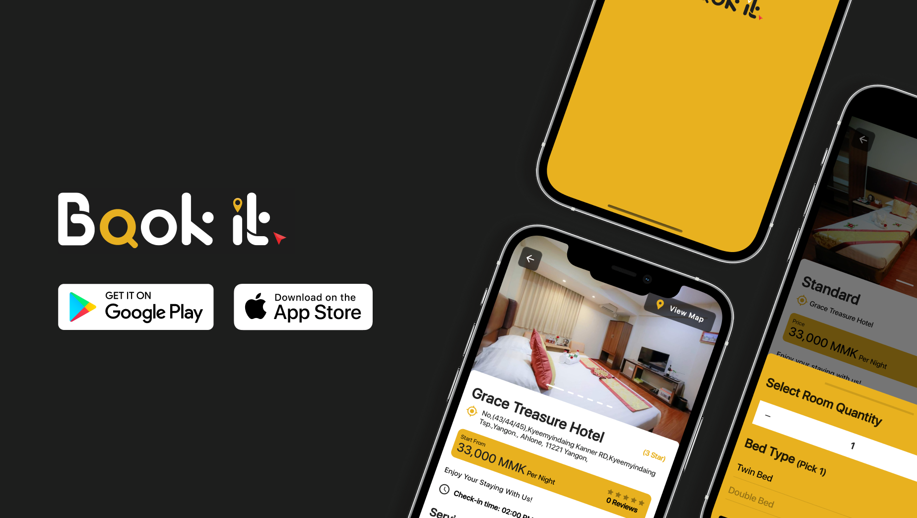
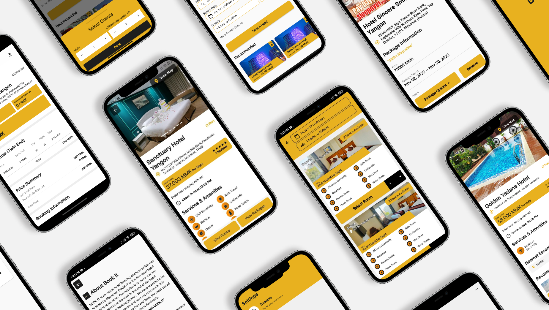
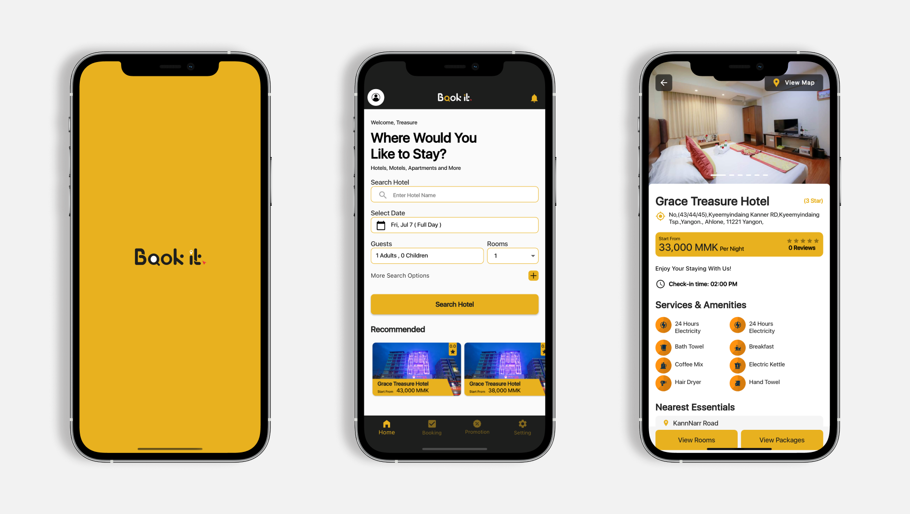
App Interface
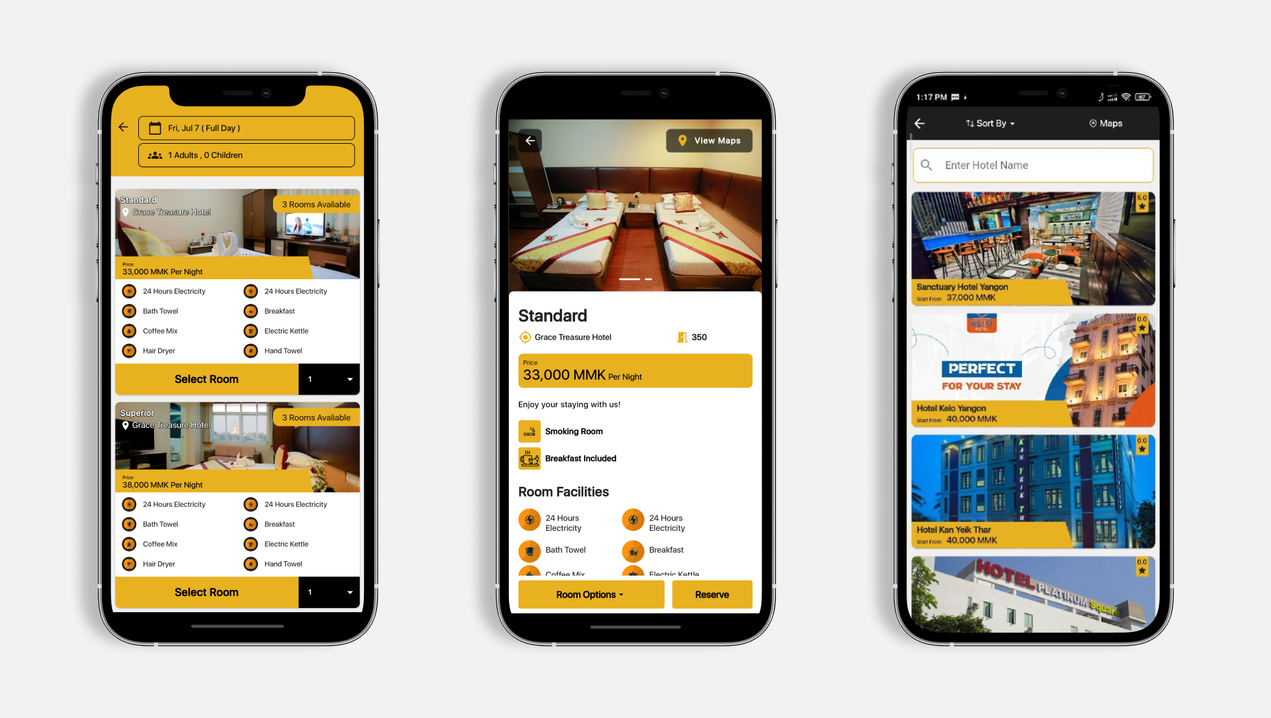
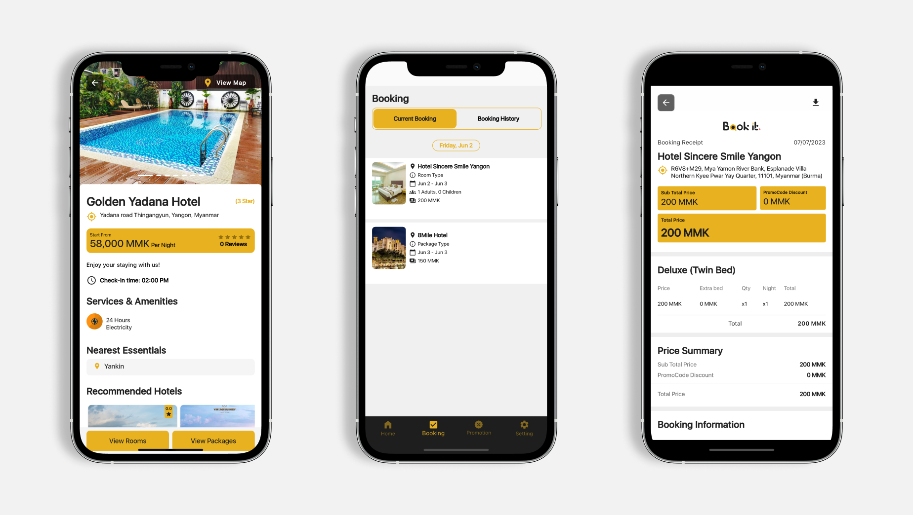
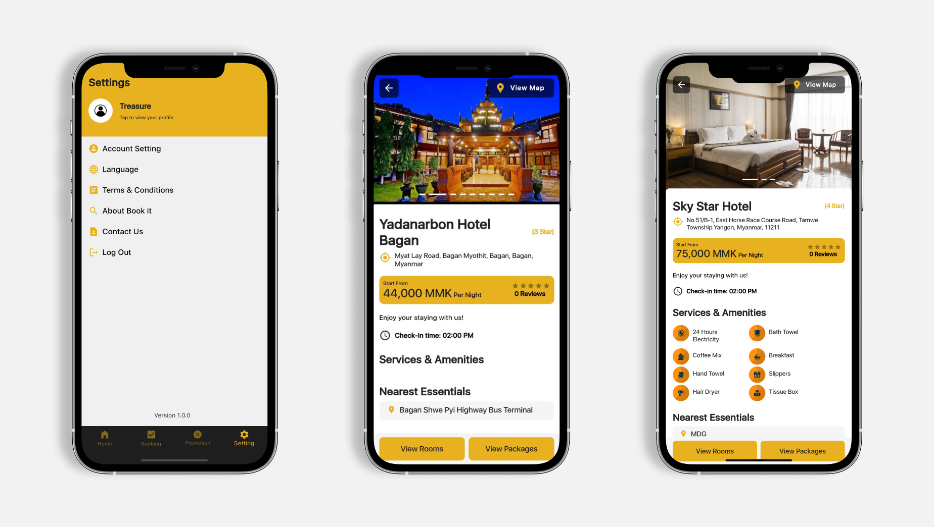
Key screens from the frictionless booking and payment experience.
Six Choices That Drove Conversion
Each decision targeted a specific friction point that was causing abandonment.
What the Redesign Changed
Results
Measurable impact from obsessive focus on payment friction.
Lessons Learned
Book It — Hotel Booking App
iOS & Android app design · Southeast Asia · 2023