Project Background
Myanmar · 2022–2023 · Visual Design Lead · UI/UX Designer · Project Coordinator
About Galaxy Software
Galaxy Software had spent 12 years building Myanmar's most trusted enterprise software business — 10,000+ customers, 9 branches nationwide, products running the POS systems of hundreds of restaurants and the ERP of major businesses across the country.
Their website told none of that story.
My Role & Scope
A Market Leader with a Website That Didn't Match
Mismatched colors, marquee text, no visual hierarchy. A business charging 60,000–80,000 MMK per user per month was being represented by something that looked like a student HTML project.
My director came to me with a clear business frustration: potential customers were visiting the website, not trusting what they saw, and leaving before ever engaging with sales. This was the first corporate website redesign I'd ever led. I had one other designer, a tech lead, and two frontend developers. No template to follow.
Credibility Gap
The visual quality didn't match the pricing or the company's market position. 12 years of market leadership was invisible.
No Audience Segmentation
A restaurant operator and a business owner looking for ERP have completely different needs. The site treated them identically — no entry points, no tailored paths.
No Conversion Path
The "Get Quotation" CTA was buried. Users couldn't find their nearest branch or figure out how to get support — the things that drive purchase decisions in B2B software.
Brand Consistency
With multiple products, branches, and a bilingual audience, the old site had inconsistent visual language — different typographic treatments, inconsistent use of the brand's purple and gold palette.
Mobile Experience
Mobile internet usage is dominant in Myanmar, but the old site was desktop-first with poor mobile optimization and touch targets.
Feature-List Product Pages
Product pages were feature dumps. No problem framing, no benefit statements — nothing that connected what the software does to why a business should care.
Three Core Audiences
Each audience has different needs and decision-making processes
U Kyaw
Business Owner evaluating ERP
Male, 45, import/export SME owner, Yangon
"I've heard Galaxy Software is the market leader, but before I commit 60,000–80,000 MMK per user per month, I need to see that this is a serious company with proven products."
Pain Points
- Outdated design made him question Galaxy's credibility and market position
- Feature lists with no context — couldn't tell what problem each product solves
- No clear path to "Get Quotation" — CTA was buried and inconsistent
- 10,000+ customers and 9 branches not visible — missed credibility signals
Website Goals
- Quickly assess that Galaxy is a credible, established software company
- Understand what iStockEnterprise solves for a business like his
- See pricing structure and understand the investment clearly
- Easily reach the sales team via a persistent "Get Quotation" CTA
From 'Fix the Visuals' to 'Rebuild How the Business Presents Itself'
My director pulled me back early: 'The visuals are the symptom. The real problem is that people don't know what we sell, who it's for, or why they should trust us.'
Audience-First Navigation
Restructured around product type rather than company structure. Three distinct user types, three distinct entry points.
Consistency Across 7+ Products and Two Languages
With 7+ products and a bilingual audience, consistency without a system would have been impossible to maintain across 5 team members and two languages.
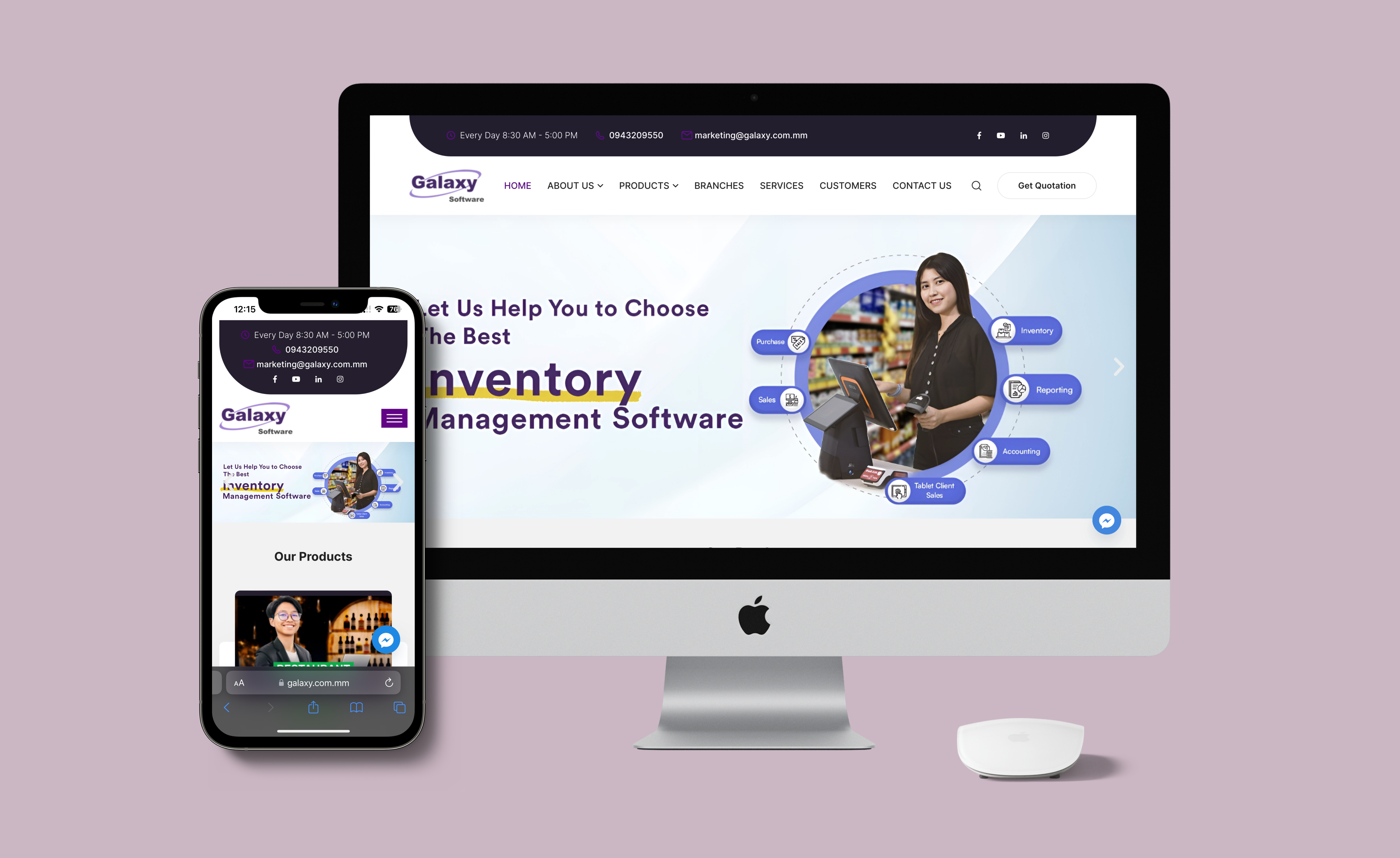
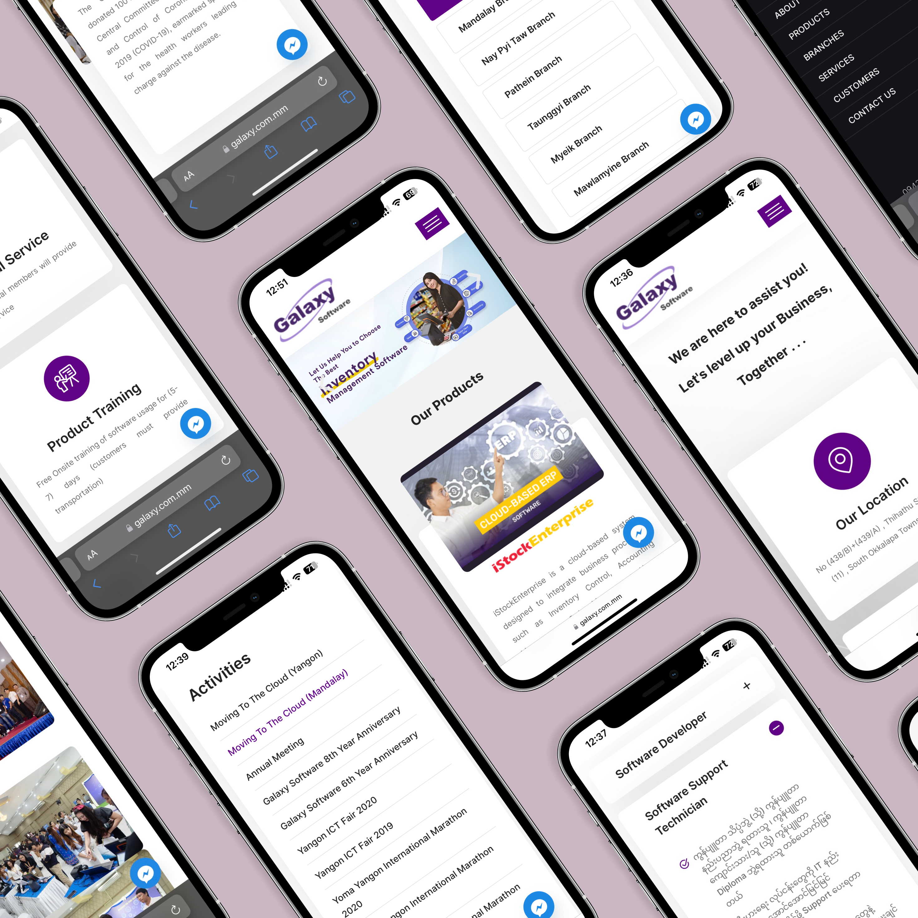
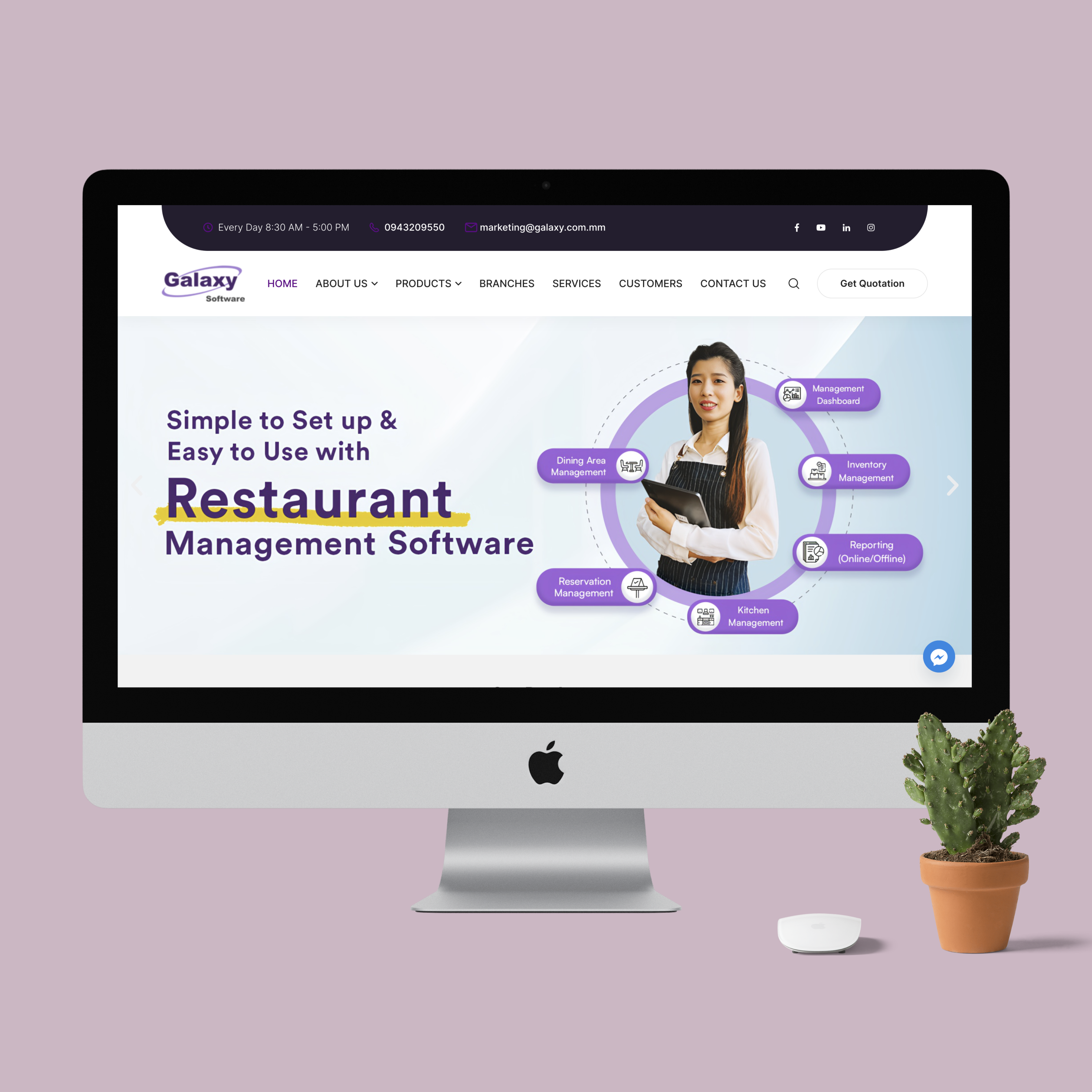
Website Interface & Features
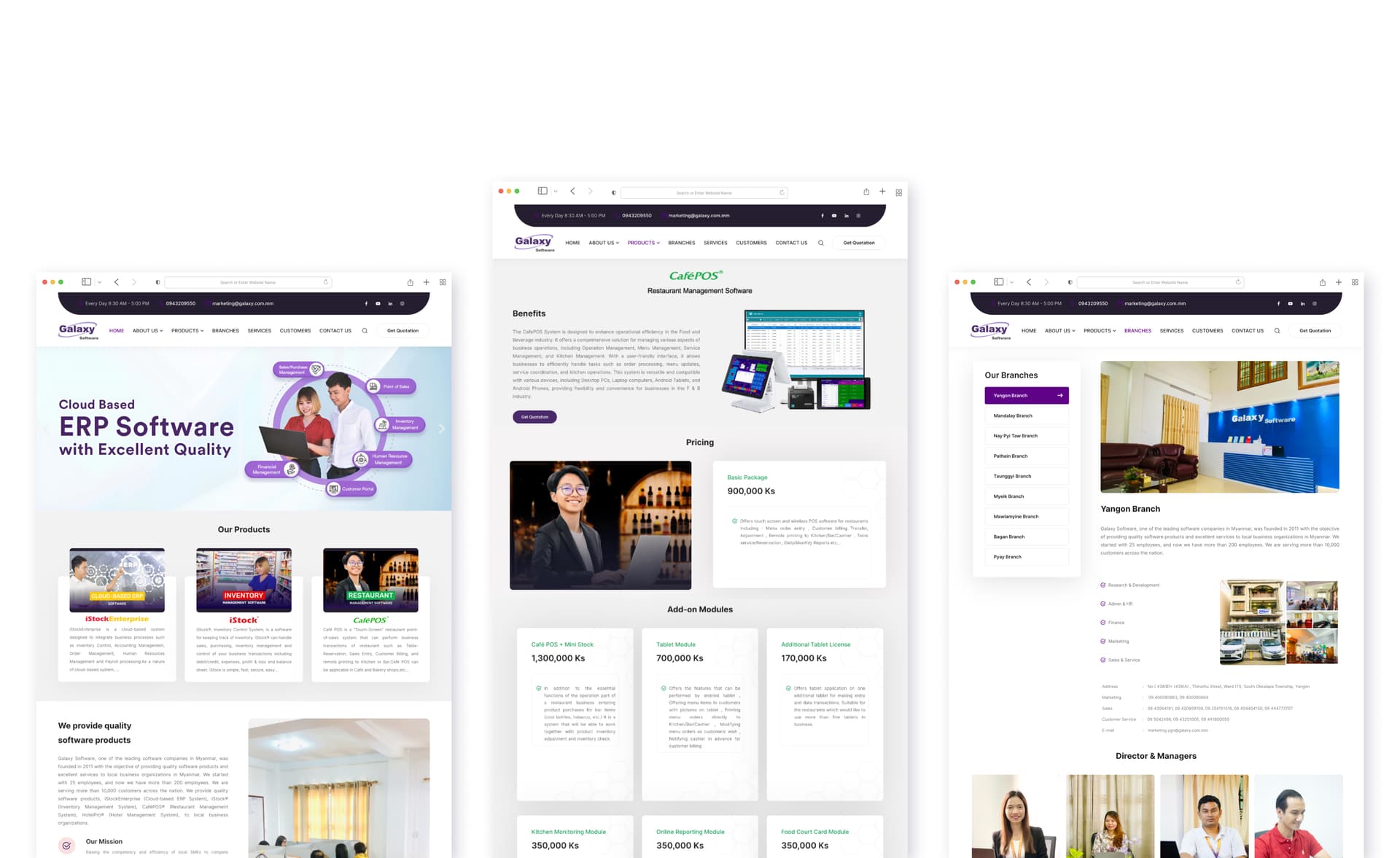
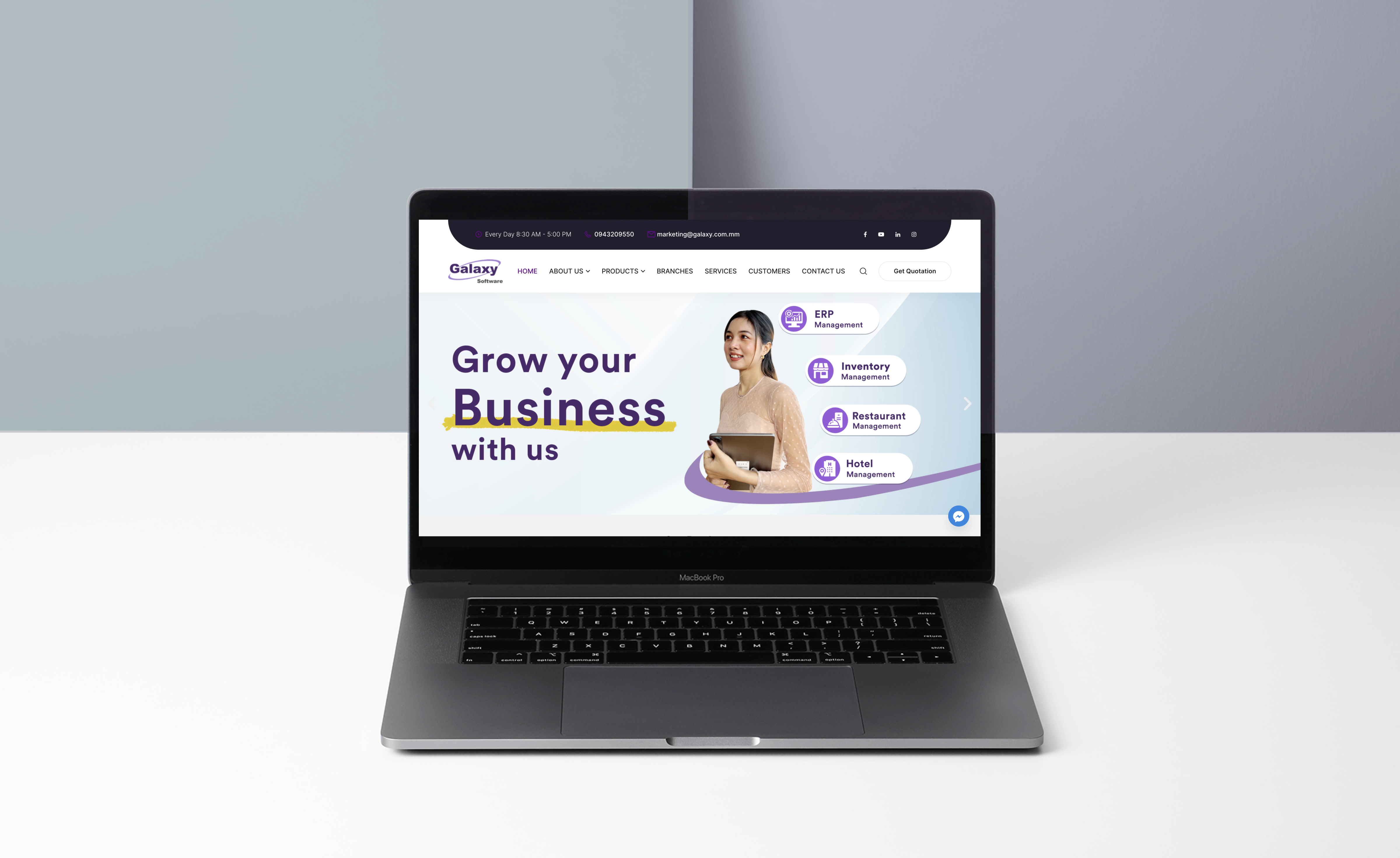
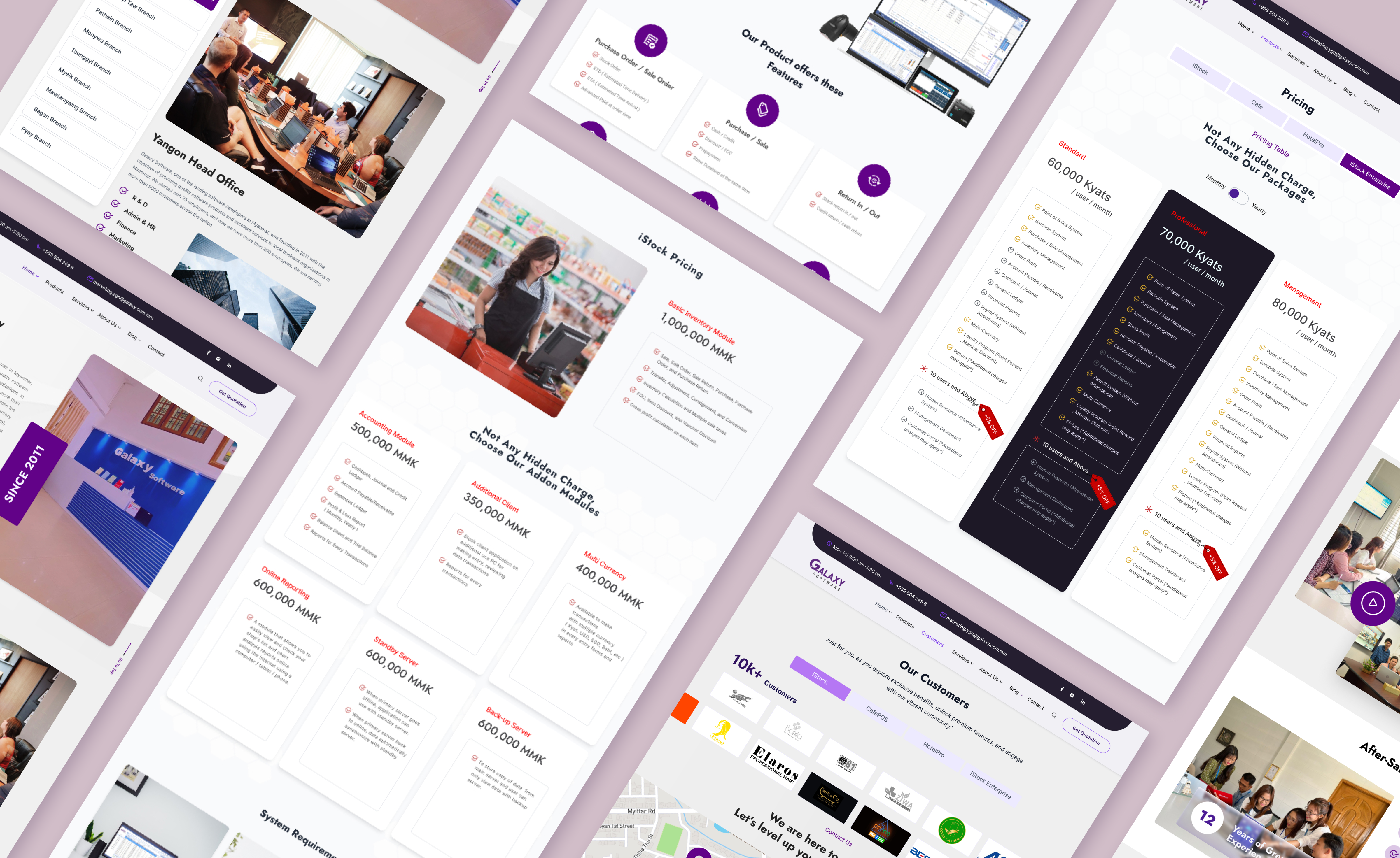
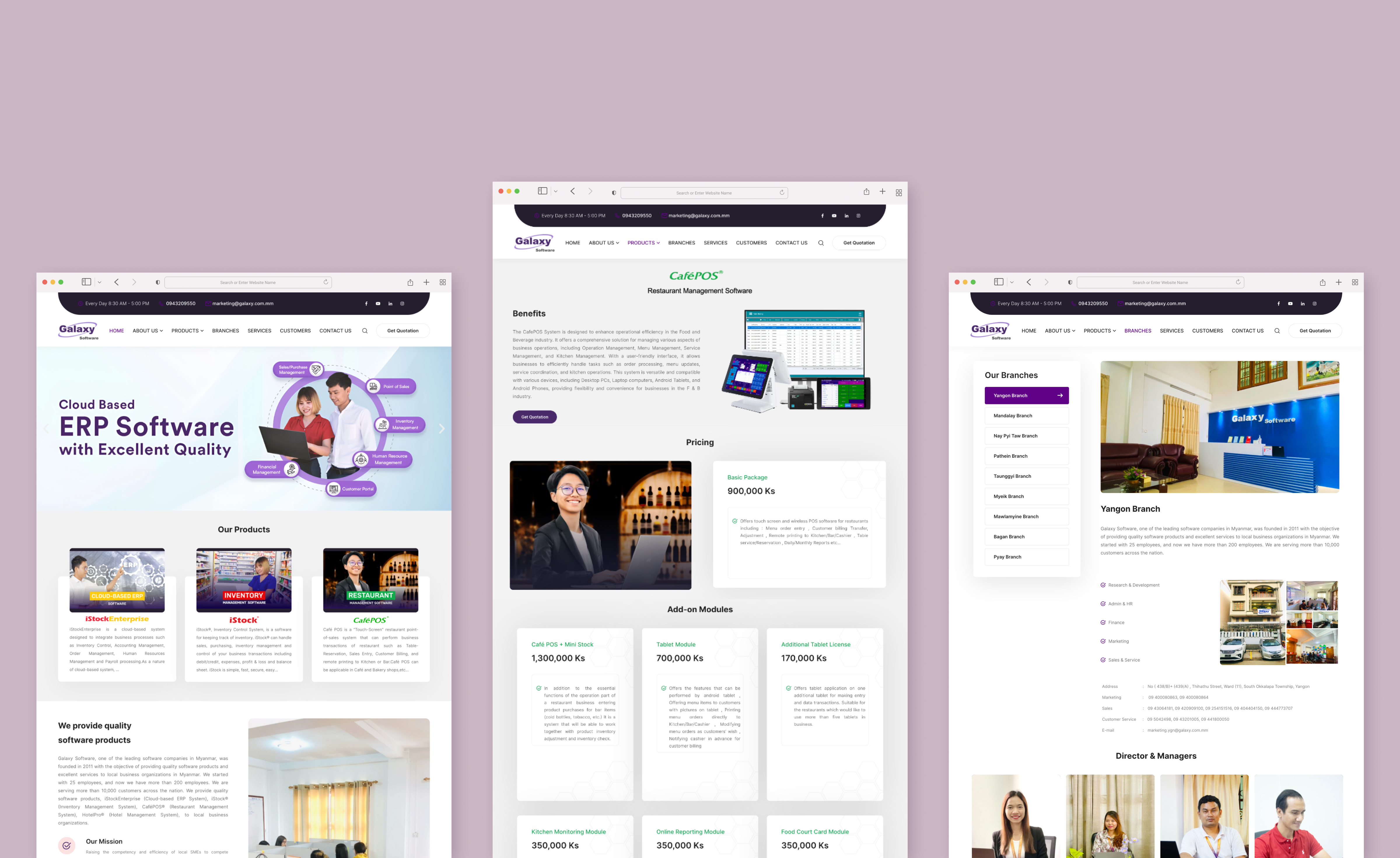
Key screens showing the redesigned experience across all products
Before vs. After
Measurable improvements across all product lines
Results & What I Learned
After launch, the impact was visible quickly.
Users who arrived were now finding what they needed and staying — the credibility gap was closing.
The sales team started receiving more qualified leads directly through the website.
Users could now self-serve branch locations, product info, and basic support — reducing inbound calls for findable information.
The internal team has maintained and extended it independently since handoff, with no design breakdowns across 7+ product pages.
“The website was now the first thing the sales team sent to prospects before a meeting, rather than something they hoped prospects wouldn't look at too closely.”
— Director feedback, three months post-launch
A note on the numbers: I don't have precise analytics figures from this project. The outcomes above reflect what was observed and communicated by the director and sales team post-launch. If you're a hiring manager who wants to discuss specifics, I'm happy to walk through the decisions in detail.
Cross-Functional Reality
Wearing three hats — design lead, UX designer, project coordinator — forced decisions I wouldn't have faced as a pure designer.
The moment I remember most: the developers wanted to simplify the responsive breakpoints to save build time. I pushed back — mobile internet dominates in Myanmar, and a broken mobile experience would undo everything we were trying to fix with credibility. We kept all three breakpoints. That negotiation taught me more about aligning design decisions with development constraints than any single project before it.
Lessons Learned
Galaxy Software — Corporate Website Redesign
Full website redesign · Myanmar · 2022–2023