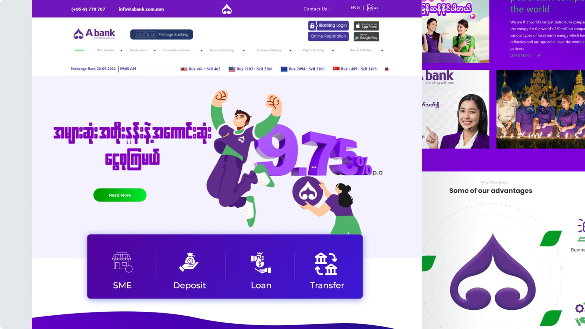
Myanmar's Most Trusted Mobile Banking Platform
A+ Wallet serves agents, merchants, and individual users across Southeast Asia — enabling digital payments, money transfers, bill payments, and merchant transactions for thousands of users daily.
With a growing user base spanning multiple countries and demographics, A+ Wallet needed a website that could serve three distinct audiences while maintaining brand consistency and conversion optimization.
Three Journeys, One Broken Website
The existing website tried to cram all three user flows into a linear experience — causing confusion, bilingual breakage, and poor conversion rates across every audience segment.
Unclear User Paths
Users were confused about which path applied — agent onboarding, merchant registration, or app download. No clear entry points existed.
Inconsistent Bilingual
Burmese localization was clunky. Typography and layout broke when switching languages.
Poor Conversion Funnels
Each user type had different goals, but the website forced everyone through the same linear flow, causing high drop-off rates.
Weak Brand Consistency
Visual hierarchy varied across sections. No unified component system or design language to maintain consistency.
Mobile Neglected
60% of users accessed via mobile, but the design was desktop-first with poor optimization and touch targets.
Missing Social Proof
No testimonials, success stories, or trust signals to build user confidence in signing up or downloading.
Three Distinct Audiences
Each user type has different goals, pain points, and conversion paths
Three Parallel Pathways
Rather than forcing users through a single funnel, I designed three clear, parallel pathways.
Agent Onboarding
Merchant Registration
App Download
Key Design Decisions
Strategic choices that moved the needle
Bilingual-First
Not English + translation, but true localization. Separate design considerations for Burmese typography and space requirements. Layouts adapt to text length.
Visual Hierarchy for Clarity
Large, scannable CTAs with clear next steps at every stage of the funnel. Users always know what action to take next.
Testimonials & Social Proof
Real agents and merchants sharing results. Trust signals placed strategically throughout all three conversion funnels.
Mobile-First Responsive
60% of users access via mobile. Every breakpoint carefully considered with touch-optimized interactions and thumb-friendly navigation.
Unified Design System
Consistent component library across all three pathways. Same design language and interaction patterns while addressing specific user needs.
Cultural Nuance
Localized not just copy, but visual hierarchy. Color meanings, imagery choices, and interaction patterns adapted for Myanmar market.
Site Map & Navigation Structure
The website uses a flat top-level navigation with 9 primary items. Partners registration lives under a single dropdown — keeping the nav uncluttered while surfacing two distinct conversion paths.
Flat Nav Architecture
9 top-level items keep the site shallow and accessible. No page requires more than 2 clicks from the homepage — critical for Myanmar mobile users.
Partners Dropdown
Agent Register and Merchant Register are grouped under a single "Partners" dropdown — reducing nav clutter while clearly signalling a B2B path.
Bilingual Toggle
EN ↔ မြန်မာ switch lives in the global utility bar, persistent across all pages. Burmese layouts use adapted line-height to prevent typography overflow.
Website Interface & Features
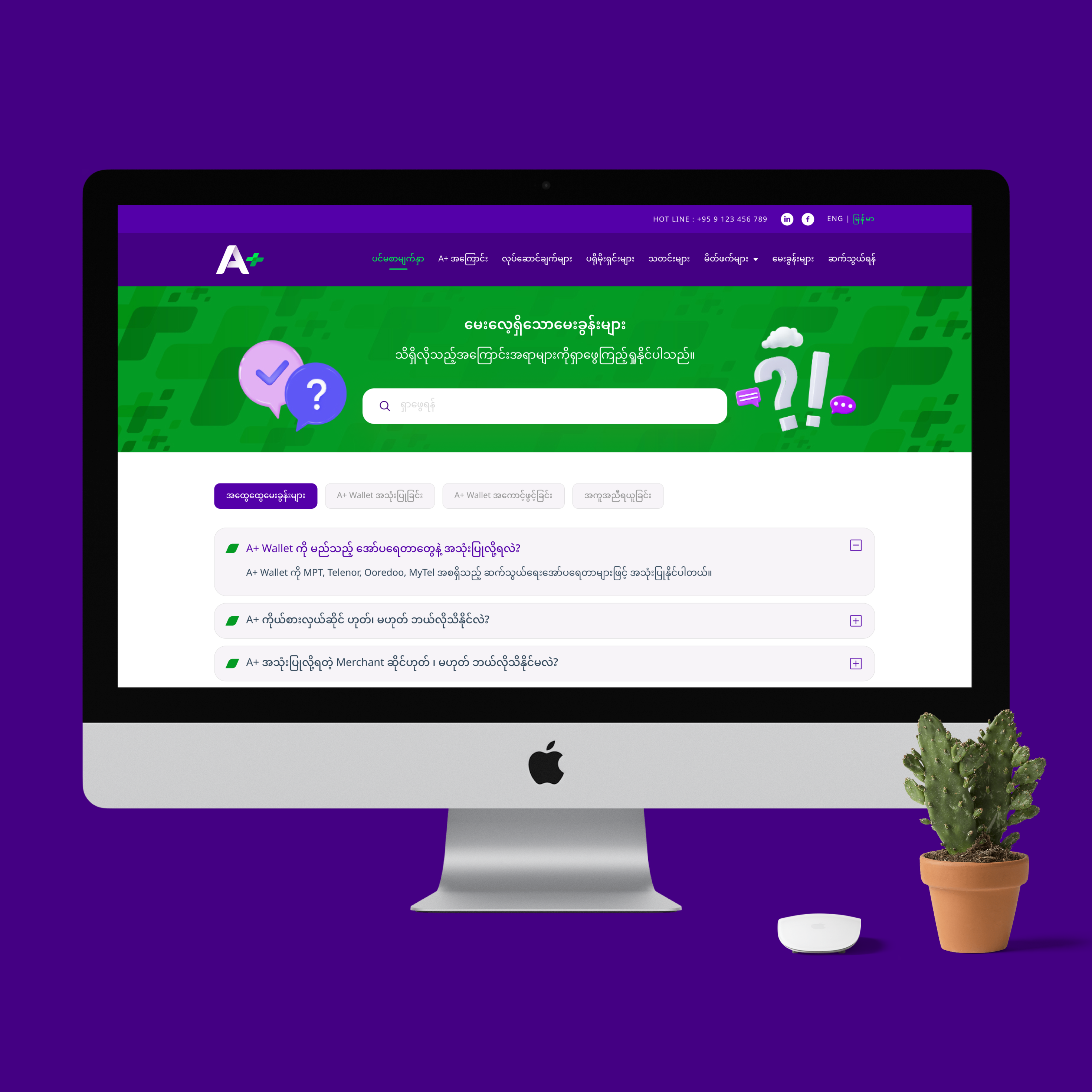
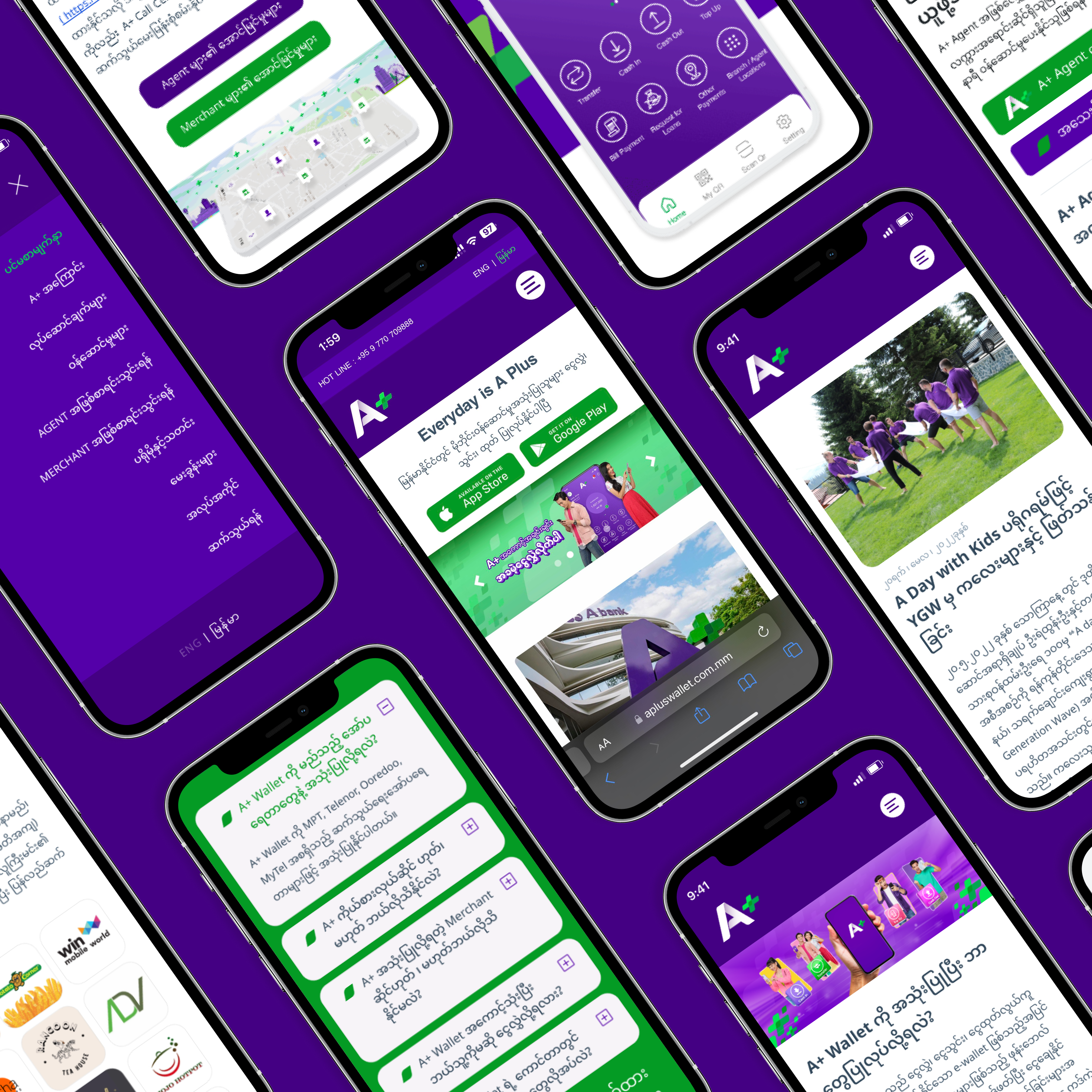
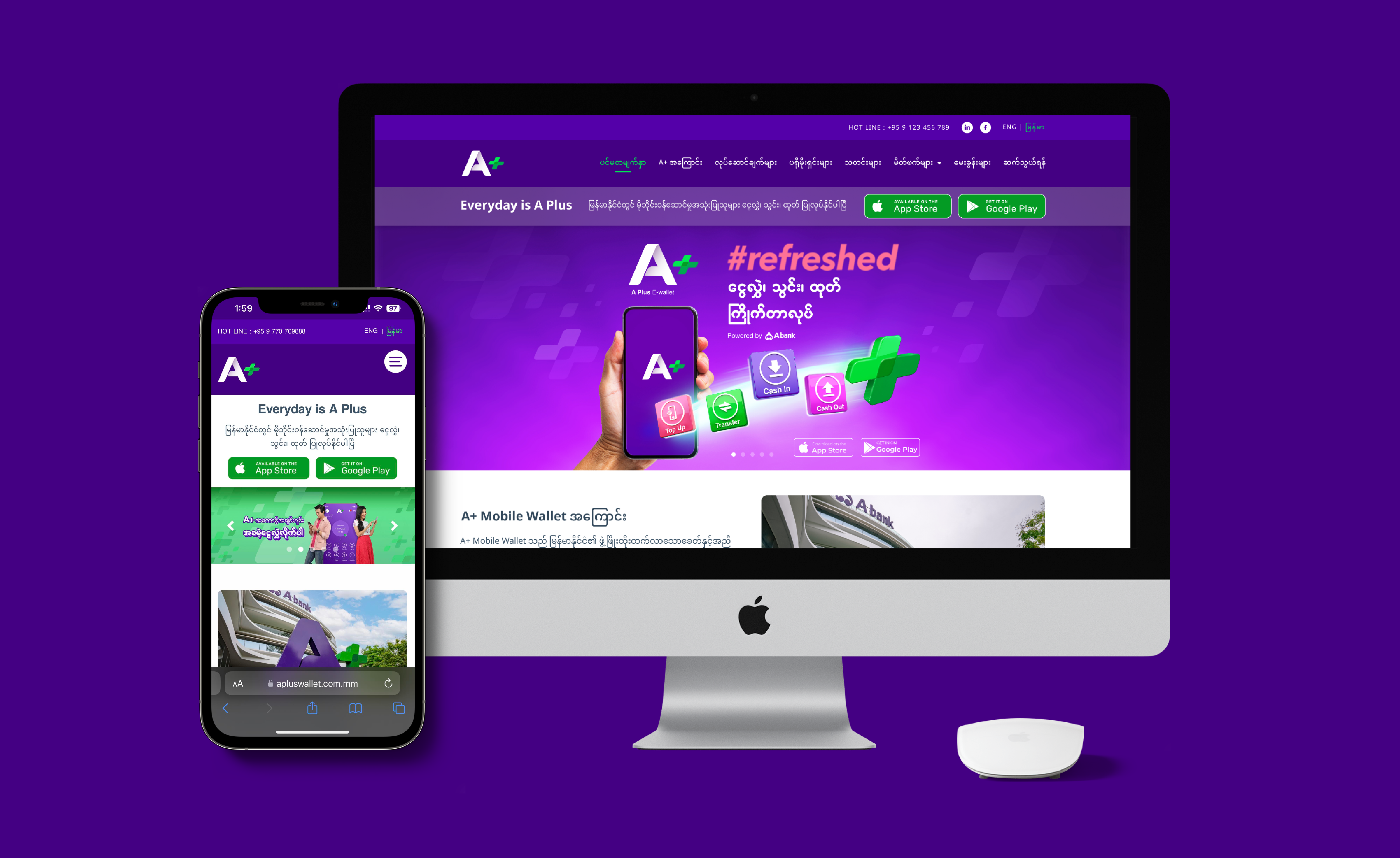
Key screens showing the three user pathways and bilingual experience
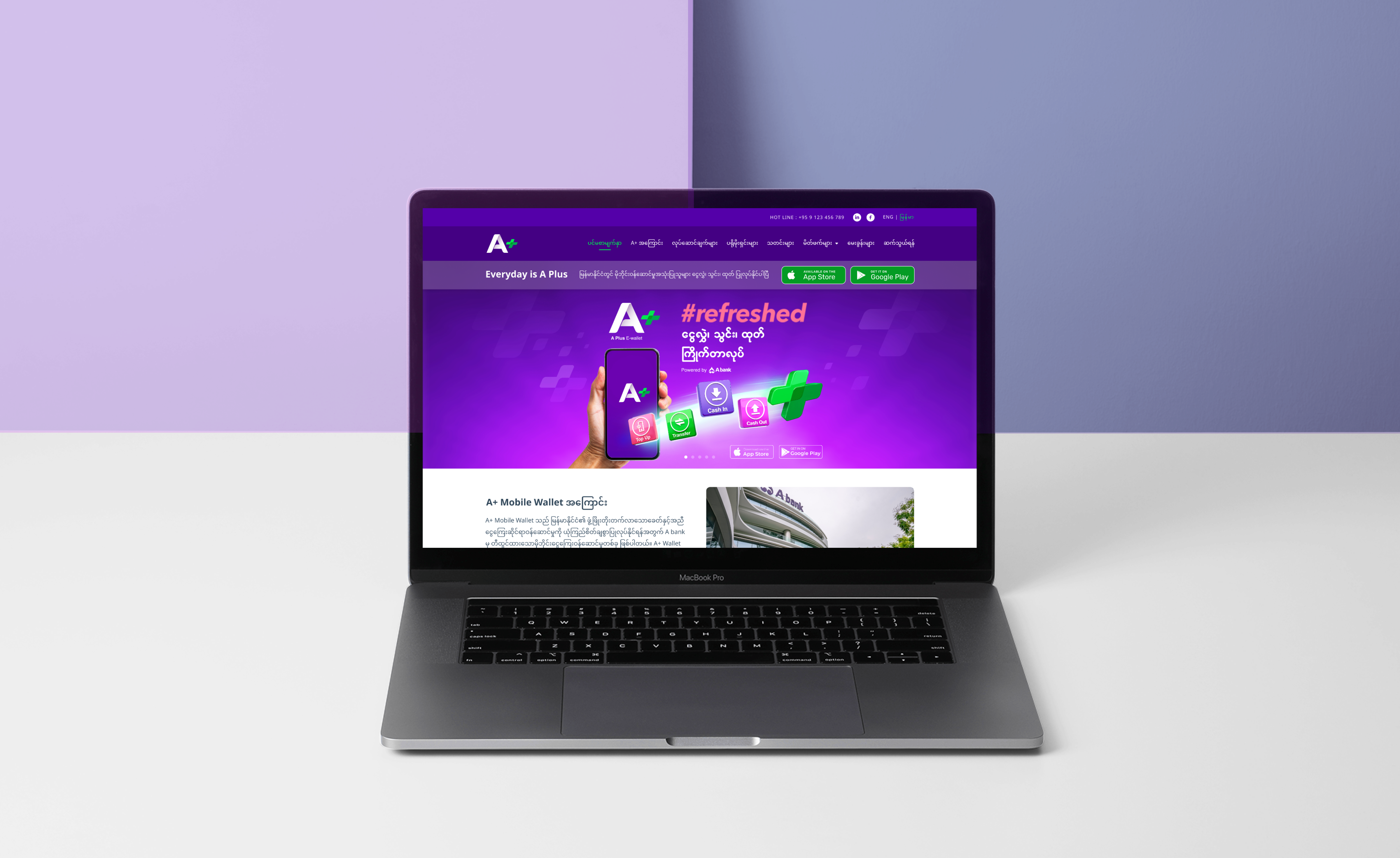
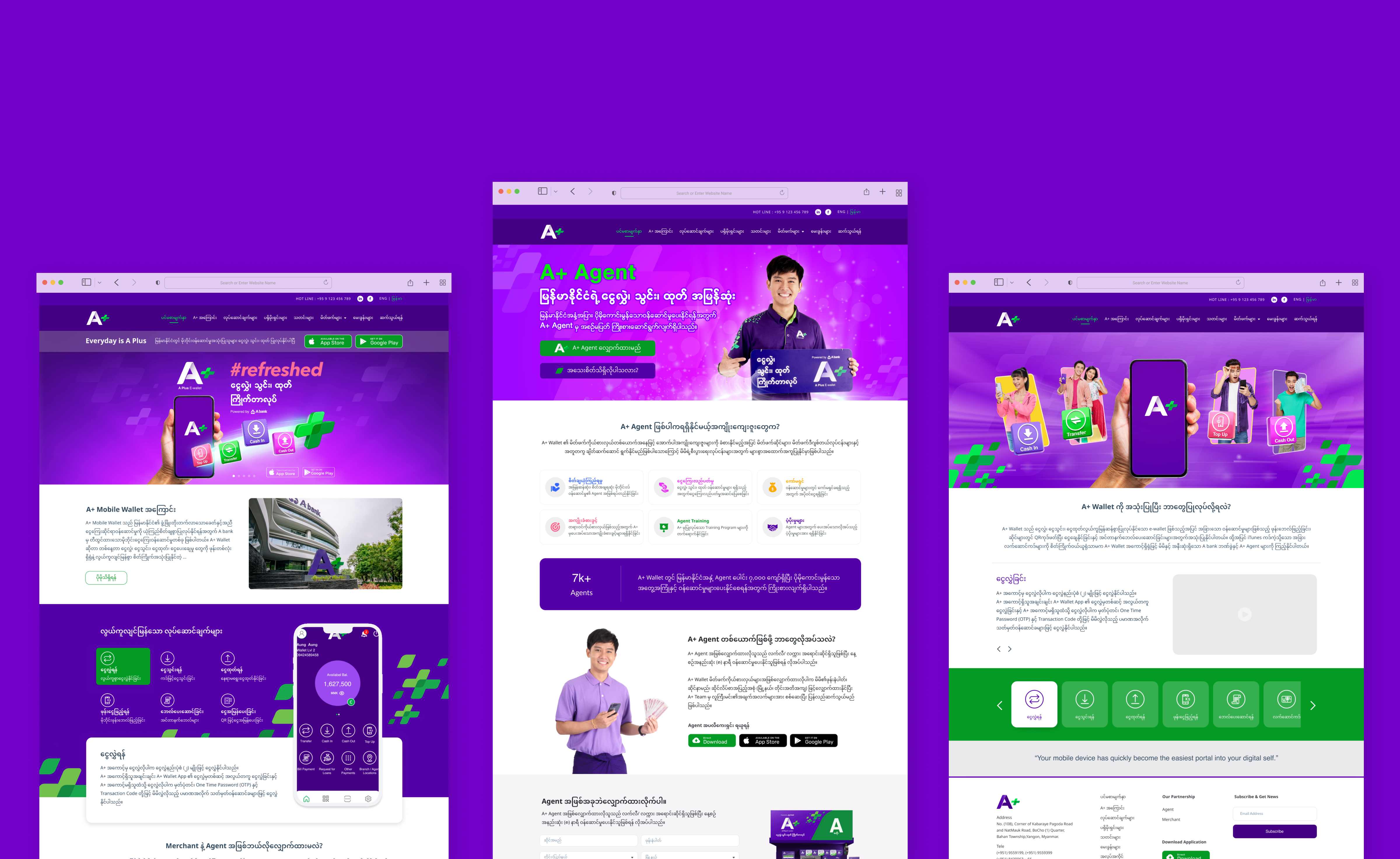
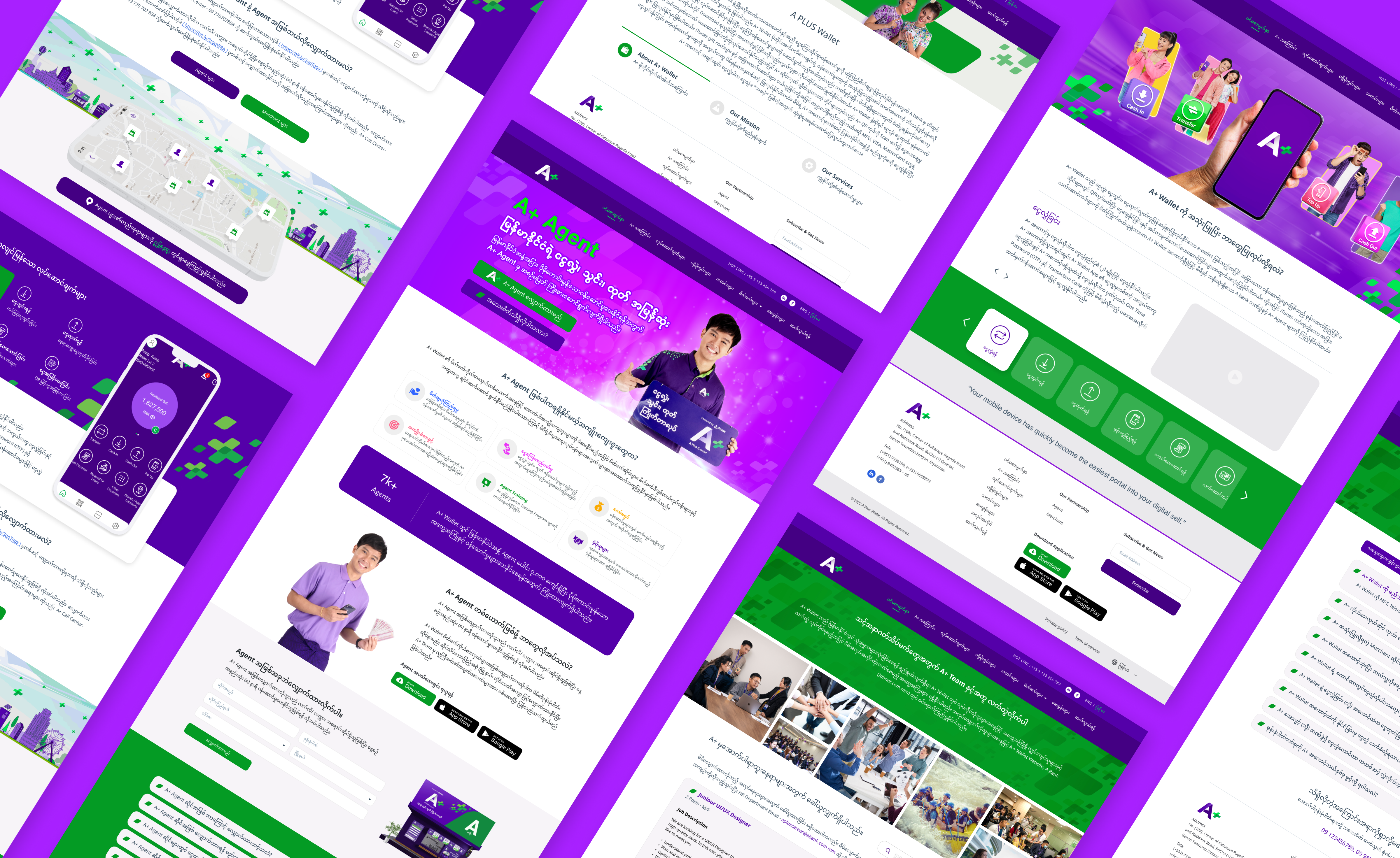
Before vs. After
Measurable improvements across all three user segments
Results & Key Takeaways
Measurable improvements and lessons learned from the redesign