Project Background
Designing a self-service ordering experience for busy restaurant environments
About Galaxy Restaurant
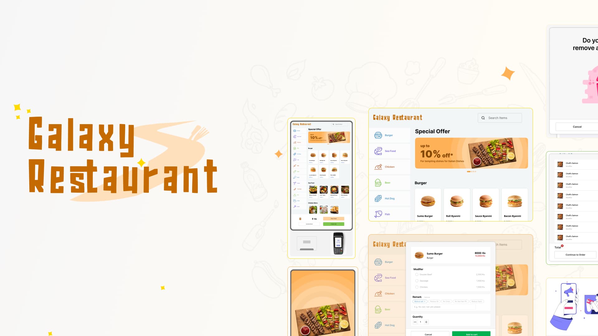
Galaxy Restaurant is a self-order kiosk system designed for the F&B industry, letting customers browse a full menu, customize their order, add modifiers, manage their cart, and check out in under a minute — entirely without staff involvement at the point of ordering.
The kiosk runs on a vertical touchscreen unit with an integrated payment terminal and receipt printer. Designed as a software product by Galaxy Software for deployment across restaurants, food courts, and hospitality venues in Myanmar.
My Role & Scope
Queue Time Kills F&B Revenue and Guest Experience
In busy restaurant environments, the bottleneck isn't the kitchen — it's the ordering queue. Staff-assisted ordering creates a linear flow where every customer requires individual attention.
Speed vs. Completeness
Customers want to order fast, but a kiosk that skips modifier options loses revenue and creates kitchen errors. Design needed to surface customization without making it feel mandatory or slow.
Discoverability vs. Simplicity
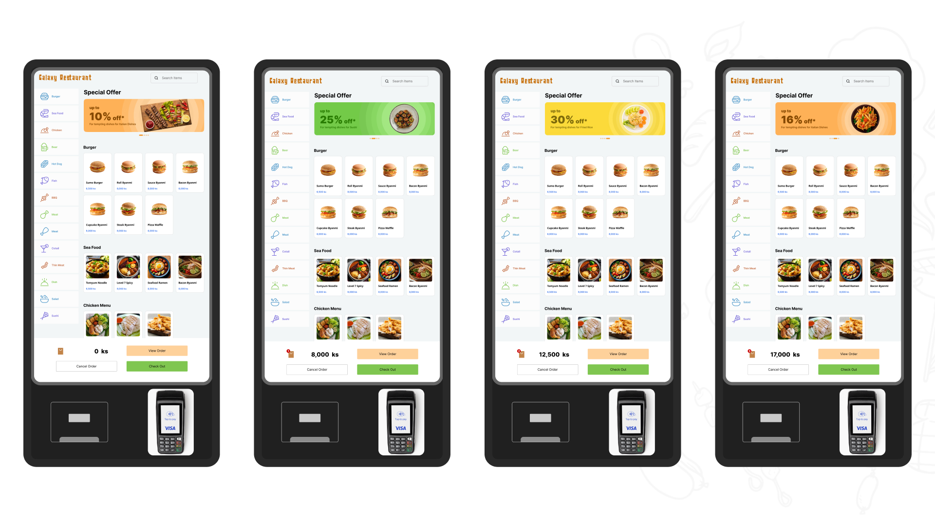
A full restaurant menu can have 50+ items across 8+ categories. Showing everything overwhelms. Showing too little means customers miss items. Navigation needed to make the full menu scannable in under 30 seconds.
Error Prevention vs. Friction
Destructive actions (cancelling entire order) need confirmation to prevent accidents. But every confirmation adds a tap and hesitation. Design needed to apply friction selectively — only where error cost is high.
Non-Technical Users Under Time Pressure
Kiosk UI must work for customers who have never seen this system before, complete multi-step transactions under time pressure, often with other customers waiting behind them.
Touch Targets for Fingers, Not Mouse
All interactions happen through touch at arm's length. Tiny buttons, small text, and precise tapping don't work. Every element must be sized for fingers and readable at kiosk distance.
Operational Efficiency vs. Guest Experience
Restaurants wanted to reduce front-of-house staffing costs, increase order accuracy, and capture upsell opportunities — without degrading the guest experience.
Target Audience
Restaurant customers ordering food in busy F&B environments
Ko Thet "The Rusher"
Time-critical repeat visitor
Male, 28, office worker on lunch break, Yangon
"I've got 30 minutes for lunch. I know what I want — I just need to order it fast and get my queue number before the kitchen backs up."
Pain Points
- Slow category navigation forces him to scroll through irrelevant items
- Modifier modals feel like a mandatory hurdle even when he just wants the default
- Misplaced "Cancel Order" tap wipes his cart — no undo, starts over under pressure
- Small touch targets require precise tapping he can't afford when rushed
What the Design Solves
- Category navigation: 1 tap to jump to his section, no scrolling through 50+ items
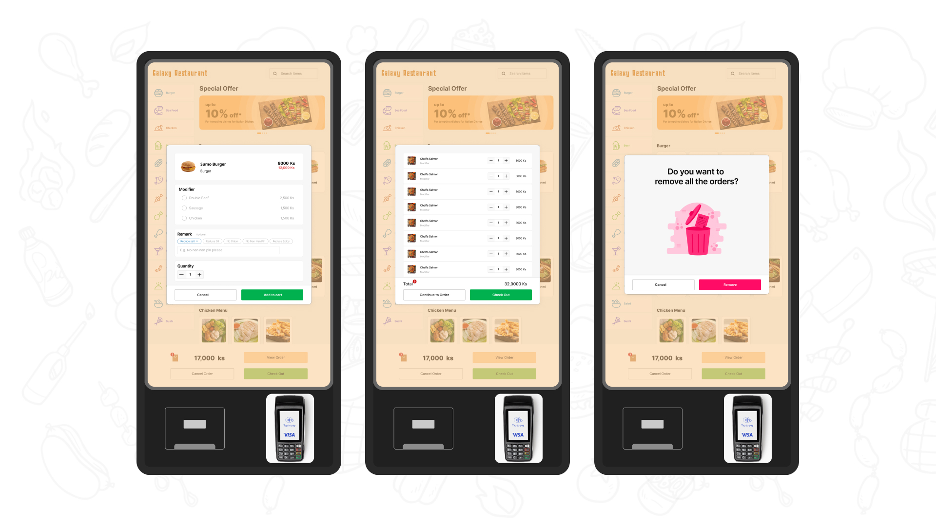
- Modifier modal: Cancel and Add to Cart clearly separated — easy to skip customisation
- Destructive action confirmation: Cancel Order triggers a dialog — no accidental wipes
- 44×44px+ touch targets everywhere — fast tapping without mis-taps
Key Design Decisions
Touch-First Ordering Experience
Five key design strategies that enabled sub-1-minute ordering
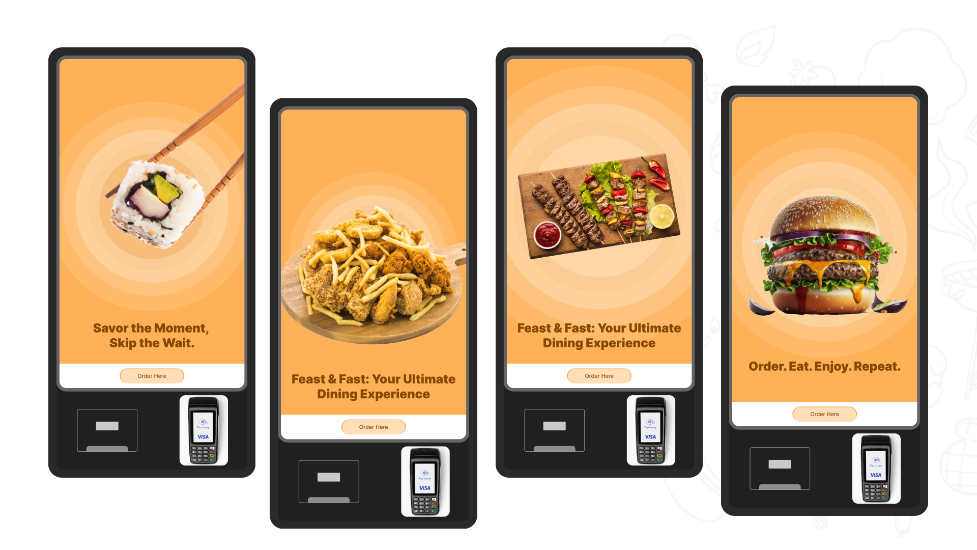
Attract Loop Designed to Convert Standing Customers
Category-Anchored Navigation for Fast Menu Scanning
Modifier Flow That Captures Customization Without Cognitive Load
Cart and Order Management with Clear Quantity Controls
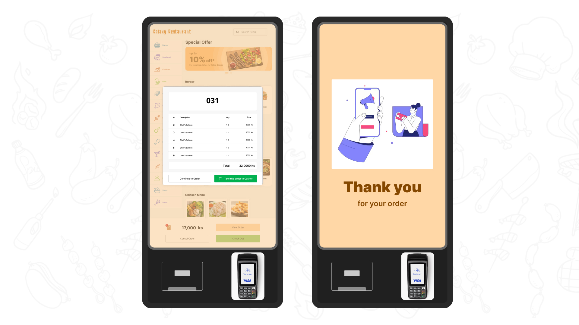
Checkout and Confirmation Designed for Speed and Trust
Visual Language for F&B Touch Environment
Warm, appetizing, and legible at arm's length
Warm Amber Primary Color
Warm amber/orange for brand header, promotional banners, and onboarding screens. Food-appropriate and energetic without being aggressive.
Action Color System
Green for all primary CTAs (Add to cart, Check Out) — universally understood as "go" in POS context. Neutral grey/white for secondary. Hot pink exclusively for destructive remove action.
Touch-Optimized Typography
Galaxy Restaurant wordmark uses decorative chunky serif with hand-crafted quality. In-app UI text uses clean sans-serif at generous sizes for touch interaction and kiosk distance reading.
Finger-Sized Touch Targets
All interactive elements sized above 44×44px minimum. Most-used controls (quantity steppers, CTA buttons, category navigation) significantly larger. Full-width CTAs at bottom easy to reach.
Appetizing Food Photography
Full-bleed food photography styled to trigger appetite, not just awareness. Warm amber palette consistent throughout experience. High-quality imagery reflects menu quality.
Decorative Background Pattern
Warm off-white background with subtle food illustration pattern. Decorative but never competing with food photography or UI elements. Creates cohesive F&B atmosphere.
Kiosk Interface & Features
Key screens showing the complete ordering flow
Before vs. After
Measurable improvements in ordering speed, accuracy, and operational efficiency
Results & Key Takeaways
Impact metrics and lessons learned from designing for touch-first F&B environments
Complete ordering experience from attract loop to confirmation
Full menu scannable with category-anchored navigation
All interactive elements sized for finger interaction
Rotating attract loop screens converting standing customers
Lessons Learned
Galaxy Restaurant — Self-Order Kiosk
Kiosk UI design · Interaction flows · Developer handoff · Myanmar · 2022
Designed for Galaxy Software Co., Ltd